We take the user journey seriously
It all begins with a question; Who is using your product? We bridge the gap between user goals, and business objectives through thoughtful research & design.
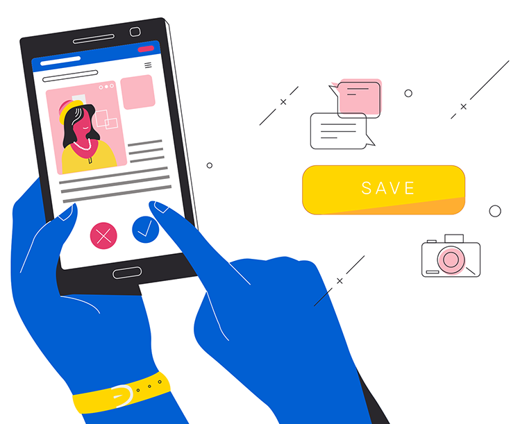
Making a Connection
We interview stakeholders and observe how customers use your product.
- Questionnaires reveal trends.
- One-on-one interviews reveal insights.
- Heat-maps reveal tendencies.
- Usability tests uncover pain-points.
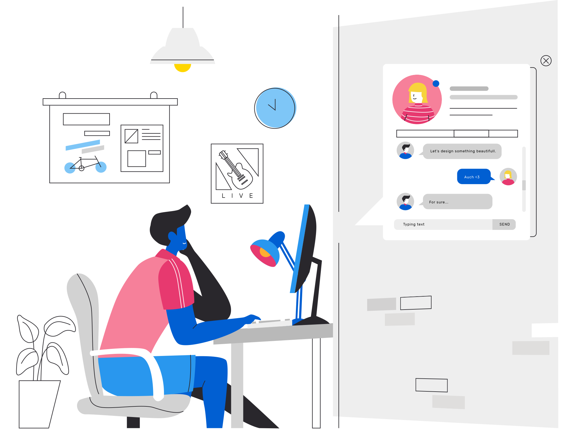
Crafting User-Centric Structures
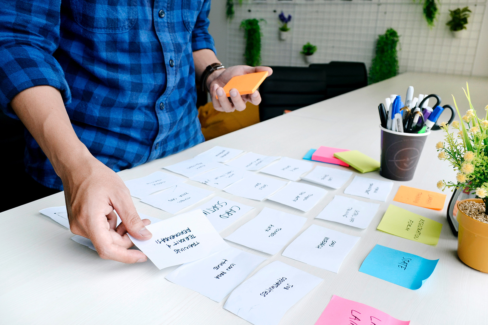
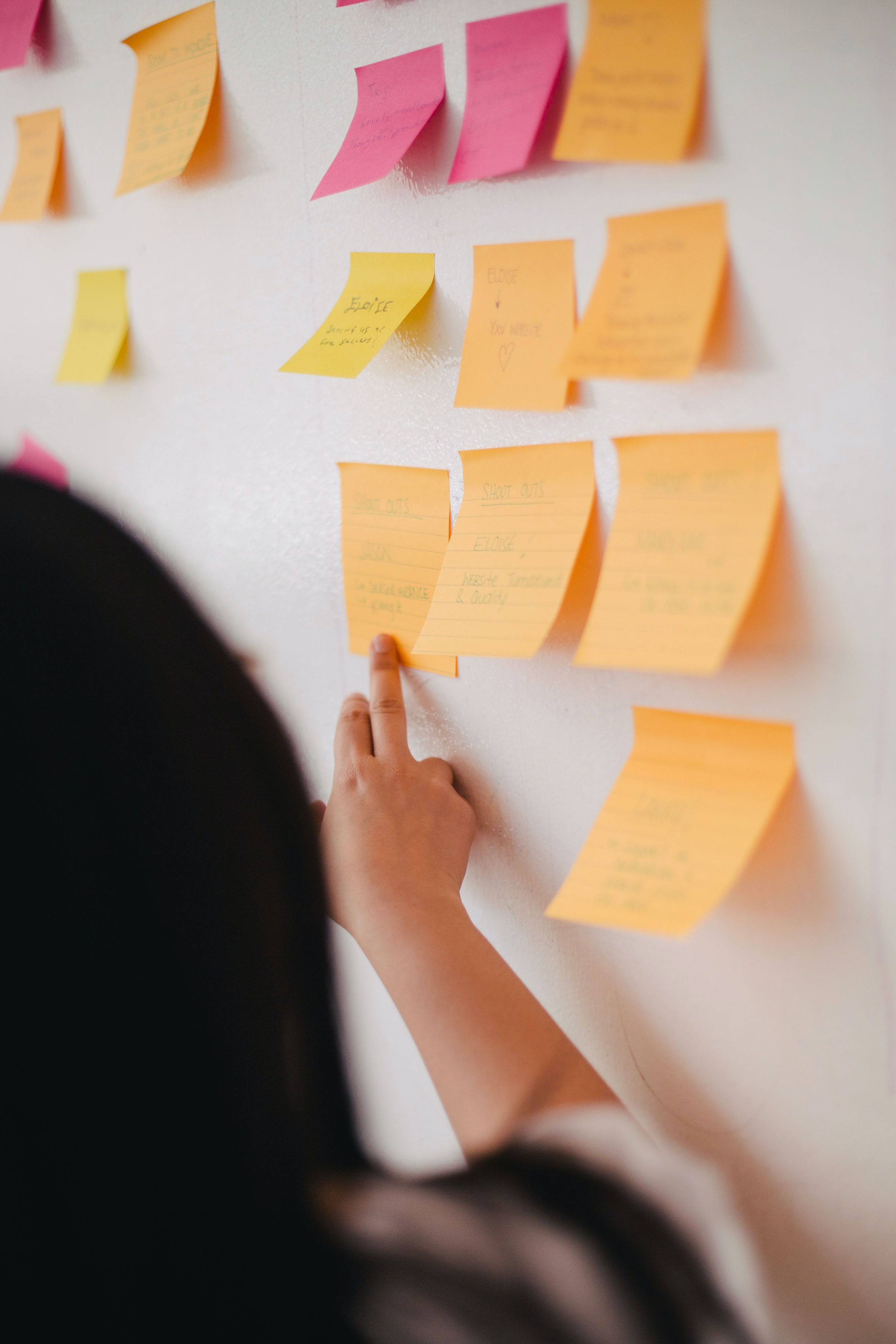
Information architecture is the cornerstone of a user-friendly and intuitive digital experience. Our team includes end-users in card sorting activities where they reveal their mental model by interacting with your data.
With this new knowledge we design navigation pathways that make content easy to find and easy to remember.
Illuminating User Pathways
Flow diagrams shed light navigation requirements. We conduct in-depth analyses to visualize user journeys, enabling us to increase goal completion and conversion by eliminating redundant or underutilized elements.
We explore how individuals engage with your product, identifying pain points, bottlenecks, and opportunities for improvement. By understanding the user's digital journey, we gain valuable insights to inform our optimization efforts.

Prototyping & Testing
We believe in the power of rapid prototyping and real-time testing to reveal how each design aligns with users' expectations. Our focus is on usability and human interaction. Dlightning is committed to raising the experience standard, while optimizing technology for engagement, safety, and productivity.
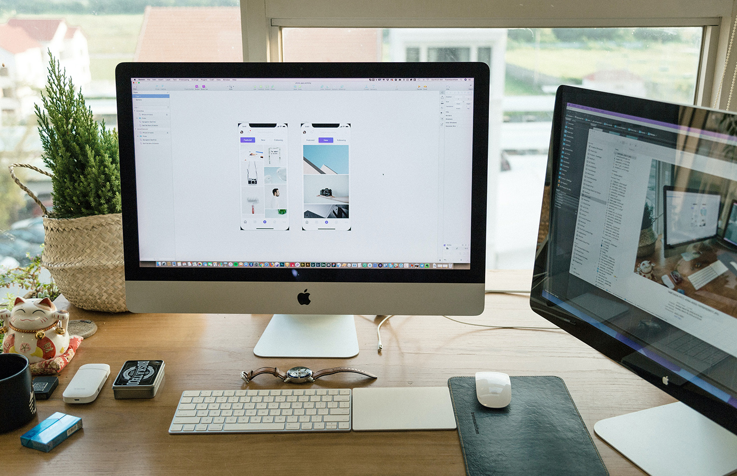
AI Integration & Opportunity Assessment
Modern products increasingly leverage AI to enhance user experiences and automate complex workflows. We evaluate AI integration opportunities during product discovery, identifying where machine learning, natural language processing, or intelligent automation can create measurable value.
Our team assesses technical feasibility, helps you select the right AI solutions, and designs integration architectures that align with your product goals. From conversational interfaces to predictive features, we ensure AI enhances—rather than complicates—the user experience.

Scaleable Brand Style
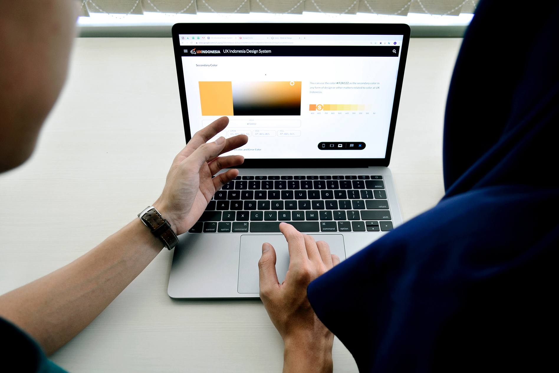
Visual design and aesthetics leave a lasting impression with your customers. At Dlightning, we understand the importance of creating a cohesive and compelling visual identity. Our unique approach ensures that your brand not only looks good, but also resonates with your audience.
D⚡ powers us to delve into the psychology of design, ensuring that every design element aligns with your brand's values and messaging. We believe that beauty is not just skin deep; it's a reflection of your brand's intention.

Designed For Success
We've built a suite of tools that allow us to provide consistent high quality output.
We'll help you build a detailed persona, validate design, and develop high-fidelity prototypes.
Experience Builder
Starting with fundamental project specifications, we build a detailed case-study to inform our design decisions.
Screen Builder
Screen Builder allows us to test designs quickly ensuring that colors and styles are waypoints not stumbling blocks.
Structured Development
High fidelity screen designs allow us to seamlessly transition into engineering without ambiguity.